Sunday 27 July 2008

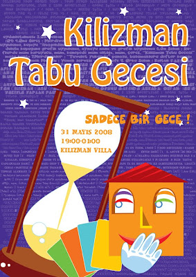
kilizman tabu night


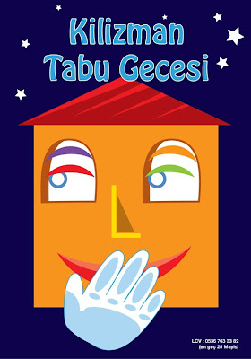
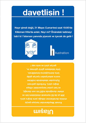
The party of "Kilizman Tabu Gecesi" happened in May 31st 2008 by the organisation and design of Hasan Isikli, the illustrator, graphic designer and conceptual designer.
The place, Kilizman Villa has been engaged after a presentation to Miss. Nihal Yesilturna, the governor of the villa which belongs to Mrs. Fatma Yesilturna.
The general concept of the party consisted of two components. First, the Kilizman Villa, a bourgeois country house which was degenerated, having a wild look after the fire that it had been. Second item was "Tabu"; a popular game played by groups which means a friendly atmosphere.
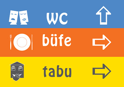
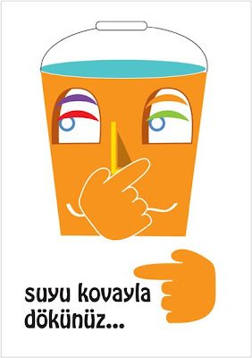
The mixture of two titles provided a special contrast bringing a balance in a whole: gloomy – lightly, mat – shiny, horrible – happy, natural – artificial. The wild part was generated by branches of trees, the stones and the leaves whereas the friendly joyful ambiance was in the game room, dining room and also in the bathroom. It has been installed the balloons, the five colour covers; red, yellow, blue, green and orange which signify the diversity and the dynamism of the game and specially, the graphic applications such as signs, poster and other graphical concept installations.
Between the people who participated to the party, there was Seda & Mete Capanoglu, the fondator of the textile mark "River", Enver Erinç; the model designer and the director of buying and selling with ISO in "Ulusoy Pompalari"and the drummer Can Hakan Vermezoglu. The people entertained by the musics of DJ Zeynep Kiliç and had an unforgettable night.


illustration pinguins


Sunday 15 June 2008

Nihal Yesilturna, the ceramic artist


Well, when you have a command from an intellectual ceramic artist, you have to pay attention her/his art, his character and his style. It is valid for the other customer too, but I am fond of analysing the people (well, if you watch regularly this blog, you can be sure !)


So first of all...I drank a cup of tea with her. The advantage, I know her from my childhood. we talked not really about the visiting card but, we talked about the exhibitions, the ceramic in Izmir and in Turkey, then about her mother. I realised that she is a woman who pretends to be strong and rational, but inside she is very fragile and sentimental. Actually, she is like a ceramic ; she is so modern, urban, chic etc. but, she is attached to her values, to her rooths. Finding this match between her character and her job, I focused on soil colours which signify the ceramic but at the same time the rooths, the stability. As a form, it would be suitable the strongness and softness of an elipse with the finest initials of her name inside. That would mean strong and chic but very fine and fragile inside.


As I know that she has got so much books, I decided to design an exlibris for her. Because, she lends frequently her books but sometime the people exploating her giving back lately. When I gave her her exlibris gift, she was very happy !

Wednesday 14 May 2008

mopak notebook cover competition


Whan I saw the competition annonce sheet, I reminded my school days and I thought that it would be joyful to participate to the competition eventhough I have nothing at the end. First of all, I looked at to the web page of MOPAK company, then again the sheet. There was no specific age target, neither sex. So, I decided to illustrate a notebook cover which would be pleased by a teenage girl, a young boy, a little boy but also a little girl...It seems not easy, because each one has a different taste, different style. Also, I realized that the notebook cover would motivate the pupil/student to open it so that she/he wants to work. at least, I wanted that the student shall not be annoyed during the lesson even in history. Because, she/he could look at the faces, add some bears, moustache or glasses or other things that we used to do. Besides, observing the increasion of extremist nationalim in the world pushed me to put the people all around the world. In spite of the media, the world is not consists of some popular countries. If I tell about he technic, I chose oil pastel, because it has a special texture which provides a naif result with bright hues. At the above, you will see the details of the composition.

Sunday 4 May 2008

graphic system


a project for a printing house...I focused on the printing machine, the print colors CMYK. This way the four colours and geometrical century gothic gave life to the work.

my mother and my mother


My mother is a very actif woman. She is not only organising trips and meetings for her friends, but she is also the president of the Association "Turkiye Anneler Dernegi Karsiyaka Subesi" (the association of mother of Turkey, the department of Karsiyaka). She has a childish college girl character but at the same time a republican strong woman...So, I decided to design a stationey for her birthday. I focused on the contrast of powerful dominating woman and the feminin parts of her character.

human right against the homophobia

Hello! I was a bit busy in April, so let roll the projects in May...Well, this poster was designed for the competition of poster by the association KaosGL. The topic was the homophobia through the human rights. Being a dramatical subject, I selected a black background and white characters to have a political, serious references. In addition to this, I analysed the concept; what is the human rights? what is the human? As the poster would be for the meeting of human rights, I composed human profiles looking each other as if they "meet". Then, I profited classical color understanding; each color meets with its contrast. The different colored human profiles gives not only references to the diversity of human kind, but also the flag of LGBT. Besides, each profile include another profile which gives a metaphysical references saying that "each human has got one part from all the other people". The "I" is at the same time "you" and "we"...

Monday 31 March 2008

vectorel izmir clock tower


As I live in Izmir and I like it, I made for myself a vectorel stylisation of the symbol of the city ; the clock tower at the centre of the city which comes from Ottoman period. Being really in the centre of the city, or in the "heart", I focused on the urban colors of Izmir. As it i s a sunny city, it has a light values like grayish whites, pales grayish blues, ocre-beige, yellow, yellowish gray...You see, the profile of the city claims so much grayish tones because of over urbanisation having less place for the parks and gardens...

condom party !


A warming including the ideas of "yougness" and "party", so there is a special satirical approach on the topic of "AIDS" . The poster was commanded by a friend; Pinar Haznedar, who is a student in the University of Ankara, at the department of Medecine and who is also one of the organiser of the party. The goal is to attract the students in the department buildings and inviting to party but also to make understand the importance of the condom. So the idea is to express basicaly the mesage in a lovely, hiding a tension way.


creet night


Here is a vectorial illustration example of mine that I designed for my cousine’s conceptual party named "crete night" where it would have the dansers from Chios Island, crete cuisine sponsored by the governorship of Chios, the municipality of Konak, Izmir and "Sakız Adası" café.As you see, I focused on crete archaic danser form and the typical identical colors of greek culture : the tones of Mediterranean blue and white. As it would be an elegant party contrasting to local dance, I reached a solution styling the archaic dancer, the curves referring to the waves and curtains of the show. The pure, clean texture of vectored illustration gained an refined impression. Using in the archaic-vectorial dancer in bicolor comes rom the greek vases where black and white have been used frequently with foreground, background relationship. Also, a black form gives reference to the night, if not, the combination of blue-white would be too day-like. In addition, a black form provides an attraction towards the light tones.

Also, there is the ticket of the night again by the same system ; greek vectoral style giving references to the sea. Instead of typing a greek based character, I chose again helvetica combining harmoniously with the pure, vectorel layout.


Friday 8 February 2008

the postcards of İzmir and Selçuk (Ephesos / Ephese)


These are the photos that I took in October 2007 in Izmir and Selçuk-Efes. I focused on the details in the forms and play of lights. First of all, they were done in the purpose of introducing my home town which was one of the metropole in the antiquity but it lost its importance after being conquered by Persians, than by Turkishs...well, that's a history, and it should be turned the page. Nowadays the city of Izmir and the region of Izmir make the investment for tourism and fairs, but also for industry in the selected areas by municipality and the government. I will be happy if you comment about the cartpostals because I still progress in my photography interest :)